Filed under: advertising, creative, design | Tags: advertising, british airways, terminal five, virgin atlantic, willy walsh
The mayhem continues at T5. Virgin Atlantic have advertising space in T5 for a year.
I couldn’t help myself.
Filed under: advertising, awards, creative, design, Uncategorized | Tags: advertising, chip shop awards, creative, design, edinburgh fringe festival
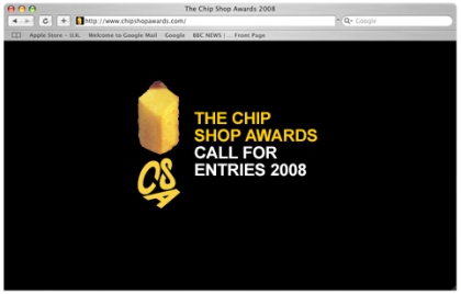
I looked up the Chip Shop Awards website and found the attached. No links, no rules, no previous winners. Pretty sure this is a temporary glitch and the 2008 entry details will be posted soon enough.
The notorious Chip Shop Awards are part of the Edinburgh Festival Fringe programme and all nominated work, is usually available to view in a local gallery.
The beauty of Chip Shop work is its simplicity – starting with the rules, which are the opposite of most awards. You don’t have to have any media spend, the client may not exist and you certainly should not be doing the work for money. The Chip Shop Awards invite you to create a campaign for any client with any spend you can conjure up: the focus is firmly on creativity without compromise.
Some of my industry colleagues have entered in the past and have indeed featured in the Chip Shop gallery. So if you’ve had a great idea for a campaign, one-off ad or had some great creative left on the cutting room floor you should pull out your pencil, de-fluff your mouse and get ready for action.
Definitely worth their salt. And sauce.
Filed under: design, Film, Typeface | Tags: advertising, design, Film, Gary Hustwit, Haas Type Foundry, Helvetica
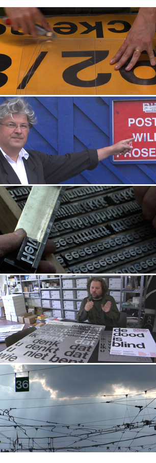
Happy 51st (and a bit) Birthday Helvetica. Ok so I didn’t see the film (yes there was a film) but I confess to this font being one of my firm font favourites. For those of you who don’t know the origins of arguably the worlds favourite (and most used) typeface please read on.
About the Typeface
Helvetica was developed by Max Miedinger with Eduard Hoffmann in 1957 for the Haas Type Foundry in Münchenstein, Switzerland. In the late 1950s, the European design world saw a revival of older sans-serif typefaces such as the German face Akzidenz Grotesk. Haas’ director Hoffmann commissioned Miedinger, a former employee and freelance designer, to draw an updated sans-serif typeface to add to their line. The result was called Neue Haas Grotesk, but its name was later changed to Helvetica, derived from Helvetia, the Latin name for Switzerland, when Haas’ German parent companies Stempel and Linotype began marketing the font internationally in 1961.
Introduced amidst a wave of popularity of Swiss design, and fueled by advertising agencies selling this new design style to their clients, Helvetica quickly appeared in corporate logos, signage for transportation systems, fine art prints, and myriad other uses worldwide. Inclusion of the font in home computer systems such as the Apple Macintosh in 1984 only further cemented its ubiquity.
Filed under: advertising, design, lego | Tags: advertising, design, lego, simple
I recently found the attached Lego adverts, created by a South African agency (FCB Johannesburg). Sometimes you see a piece of work (or campaign) and it just hits the nail on the head. In this case Lego and imagination – a simple proposition but the simple ideas are often the most difficult to come by.
Hats off to the creatives that came up with this work. 


