For those of you who missed it or like me, live too far away to visit, here are some photos of the work that was created by a myriad of this countries (if not the worlds) best known ‘stencil artists’. Enjoy.


Filed under: advertising, creative, design | Tags: advertising, british airways, terminal five, virgin atlantic, willy walsh

The mayhem continues at T5. Virgin Atlantic have advertising space in T5 for a year.
I couldn’t help myself.
Filed under: advertising, coffee, creative | Tags: barcelona, branding, coffee, dibar cafe
I like coffee. Not the granulated stuff mind, rather the fine powdery brown stuff that gets the life squeezed out of it for my drinking pleasure.
Whilst wandering the streets of Barcelona (a while ago now) I discovered a coffee company that not only tastes good but sports the kind of branding that makes you smile when you see it pass you on the side of a van, a paper cup…er you get my meaning. Dibar Café now supply their cups (and saucers) online and very good they look.
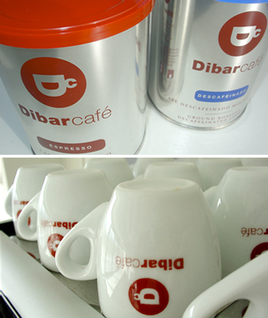
In a vain attempt to make this remotely interesting (if you’re not into branding) I discovered that by 8.14am yesterday the UK had drunk lots of cups of coffee (see graphic below). I have now idea how the UK Coffee Council (named something similar) could know this but there you go.

Filed under: advertising, creative, Film, Viral | Tags: Airport Trucks, Brand Republic, Cadbury, Chocolate, Fallon, Gorilla, Juan Cabral, T5, Viral
Cadbury looks to airports for ‘gorilla’ follow-up
Cadbury has revealed its much-anticipated follow-up to the ‘gorilla’ Dairy Milk ad, is to be called ‘airport trucks’. The new ad, which like “gorilla” has been created by Fallon, is described as a “magical airport truck race” in which a small one-man vehicle plays the role of an underdog in a midnight race against an assortment of bigger and faster trucks, such as a baggage transporter and motorised stairs.

The ad is light-hearted and fun in line with its predecessor, but unlike “gorilla” it will not feature a Phil Collins track. Apparently, “airport trucks” will feature an unnamed soft rock track from the late 1970s or early 1980s.
I look forward with some anticipation to seeing the T5 passengers baggage hurtling down the runway apron to the tune of REO Speedwagon (see what I did there – speedwagon).
Lets hope the ad is better than the service at T5.
The ad was written by Juan Cabral, the Fallon creative director who also created “gorilla”
The ad will be posted here once it has aired.
Ok so the ad is out and to be honest I think i’d have preferred the REO Speedwagon version I had in my head. Still, on the T5 angle somebody has already managed to spoof ‘airport trucks’ and as it has hardly changed from the original this is the one shown above.
Enjoy (unless you’ve flown British Airways recently).
Filed under: Blek le Rat, creative, Stencil Art | Tags: Banksy, Blek le Rat, Grafitti, King Adz, Prints, Stencil Art, Thames & Hudson
‘Everytime I think I’ve painted something slightly original, I find out that Blek Le Rat has done it as well. Only twenty years earlier.’ Banksy
Long before there was “street art” as we now know it, there was Blek le Rat. He was one of the first graffiti writers in Europe; one of the first people to use stencils to make public art on the street; one of the first, if not the first, to break away from the dominance of New York graffiti style; and one of the first to use icons instead of writing his name.
He has been an inspiration to artists all over the world, from JayBadbc to Oseas Duarte to Shepard Fairey to Banksy – whose work is often an homage to le Rat’s iconography.
A legendary figure in street art Blek Le Rat (Xavier Prou) was born in Paris in 1951. Thought by many to be the father of stencil graffiti as an art form Blek began his unique, complex and intelligent stencil works on the streets of Paris in the 1980’s.
His work has once again come to the fore (ironically thanks to the popularity of Banksy). There is a Blek le Rat book coming out, published by Thames & Hudson. Should be available in May 2008.
Enjoy the work of the ‘Godfather of stencil art’.
Filed under: advertising, awards, creative, design, Uncategorized | Tags: advertising, chip shop awards, creative, design, edinburgh fringe festival
I looked up the Chip Shop Awards website and found the attached. No links, no rules, no previous winners. Pretty sure this is a temporary glitch and the 2008 entry details will be posted soon enough.

The notorious Chip Shop Awards are part of the Edinburgh Festival Fringe programme and all nominated work, is usually available to view in a local gallery.
The beauty of Chip Shop work is its simplicity – starting with the rules, which are the opposite of most awards. You don’t have to have any media spend, the client may not exist and you certainly should not be doing the work for money. The Chip Shop Awards invite you to create a campaign for any client with any spend you can conjure up: the focus is firmly on creativity without compromise.
Some of my industry colleagues have entered in the past and have indeed featured in the Chip Shop gallery. So if you’ve had a great idea for a campaign, one-off ad or had some great creative left on the cutting room floor you should pull out your pencil, de-fluff your mouse and get ready for action.
Definitely worth their salt. And sauce.
Filed under: design, Film, Typeface | Tags: advertising, design, Film, Gary Hustwit, Haas Type Foundry, Helvetica
Happy 51st (and a bit) Birthday Helvetica. Ok so I didn’t see the film (yes there was a film) but I confess to this font being one of my firm font favourites. For those of you who don’t know the origins of arguably the worlds favourite (and most used) typeface please read on.
About the Typeface
Helvetica was developed by Max Miedinger with Eduard Hoffmann in 1957 for the Haas Type Foundry in Münchenstein, Switzerland. In the late 1950s, the European design world saw a revival of older sans-serif typefaces such as the German face Akzidenz Grotesk. Haas’ director Hoffmann commissioned Miedinger, a former employee and freelance designer, to draw an updated sans-serif typeface to add to their line. The result was called Neue Haas Grotesk, but its name was later changed to Helvetica, derived from Helvetia, the Latin name for Switzerland, when Haas’ German parent companies Stempel and Linotype began marketing the font internationally in 1961.

Introduced amidst a wave of popularity of Swiss design, and fueled by advertising agencies selling this new design style to their clients, Helvetica quickly appeared in corporate logos, signage for transportation systems, fine art prints, and myriad other uses worldwide. Inclusion of the font in home computer systems such as the Apple Macintosh in 1984 only further cemented its ubiquity.
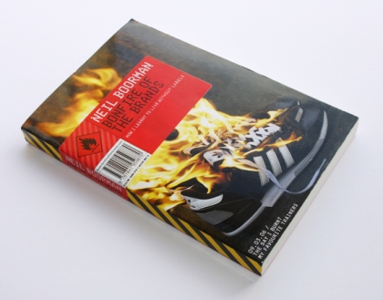
Filed under: advertising, design | Tags: bonfire of the brands, book, brands, creating passion brands, david ogilvy, interbrand, neil boorman, paul stobart
A few months ago I read a book that threw up an interesting question. Bonfire of the Brands, a book written by self-confessed brand-a-holic Neil Boorman, tells the story of the authors battle with deciding to live a brand free life.
Could I live a brand free life? Very unlikely. Not because my job is to create brands and make them desirable to the public but because in recent years everything has become branded. Supermarket ‘own brands’ are now given a ‘snappy’ name and logo in order to make them more desirable. You’ve pretty much no chance of finding unbranded items on the typical high street. It’s funny how I could see myself ridding the wardrobe of some items but there are others that would never find themselves at the amenity tip.
Worryingly, the more brands that appear, the more cluttered the world becomes and in order to create a brand that stands out the creative must work hard. Very hard.
You might well ask what exactly is a brand?
“A brand is a product, protected by trademark, which through careful management and skilful promotion has come in the mind of consumers to embrace a particular and appealing set of values, both tangible and intangible” Paul Stobart, Interbrand.
“A brand is the consumer’s idea of a product” David Ogilvy.
According to the authors Helen Edwards and Derek Day* ‘a brand is a product plus values and associations’.
*Creating Passion Brands (Helen Edwards / Derek Day).
Filed under: advertising, design, lego | Tags: advertising, design, lego, simple
I recently found the attached Lego adverts, created by a South African agency (FCB Johannesburg). Sometimes you see a piece of work (or campaign) and it just hits the nail on the head. In this case Lego and imagination – a simple proposition but the simple ideas are often the most difficult to come by.
Hats off to the creatives that came up with this work. 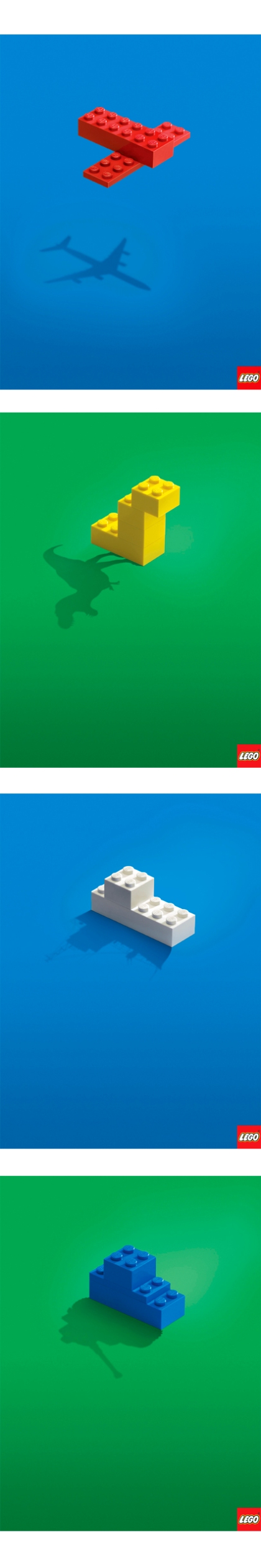
Filed under: Uncategorized
It’s been long overdue, I mean the world really needs another blog, right?
The subject covered in this beautifully created and long-pored over digital notice board will be communication – advertising, design, books etc. Who knows, I might get creative myself and write something about biscuits (I do like a fig roll) or the time I dressed up as a tiger and wandered the streets of Edinburgh. Enough for now.
I hope you find something of pleasure.
